In my article, “10 Steps to a Better Library Interior,” published in the September 15, 2011, issue of the Library Journal Library by Design Supplement, I outline several tips on how to improve a customer’s experience in your library building without spending money on a major renovation. I have had many follow-up requests for more information, so I have decided to offer a deeper discussion on each step.
Step 1: See with your customers’ eyes
Because you are in your building every day, you may not even see the interior anymore. Take a step back and view your library with fresh eyes. Walk through the building as though it were your first time using it. Can you identify the important areas of your library easily from the entry point? Is it clear where to go for help? What visual noise is in the way of these goals? Library organizations often collect cast-off or donated furniture and other items that are then shoe-horned into constricted spaces. The resulting disjointedness and visual clutter can make it difficult for library customers to find what they need or feel compelled to linger and uncover more of what your library has to offer.
Customer expectations for libraries continue to evolve, and library interiors must keep up. Libraries support lifelong learning and should do so in all of the ways that lifelong learning happens today—through print, media, face-to-face conversation, making spaces, and the Internet. Today’s library customer is also becoming more sophisticated when it comes to design. Online imagery from around the world, HGTV, highly designed advertisements, and retail stores such as Target raise the design expectations of the consumer. A cluttered library interior with poor lighting and no visual connection to its neighborhood can’t compete with the hip internet cafés on every corner, which offer comfortable, inviting places to gather and exchange ideas. User comfort, which includes the ability to navigate a building with confidence, can be obtained through the use of place-making principles, including clear pathways, clearly identified spaces, and alignment of use to type of space. Addressing each of these principles will make your building easy to use and understand.
Navigation: Consider what would make your building more intuitive to navigate. Provide clear paths to products and services. Ensure that products and services are arranged to allow a natural flow through the library. Try not to conceal highly-sought areas, such as computers or new materials. Consider a building layout that allows users to visually read the building upon entering. Allow for views to the exterior where possible. Helping people orient themselves by using known surroundings helps them understand the layout, footprint, and scale of the building more easily.
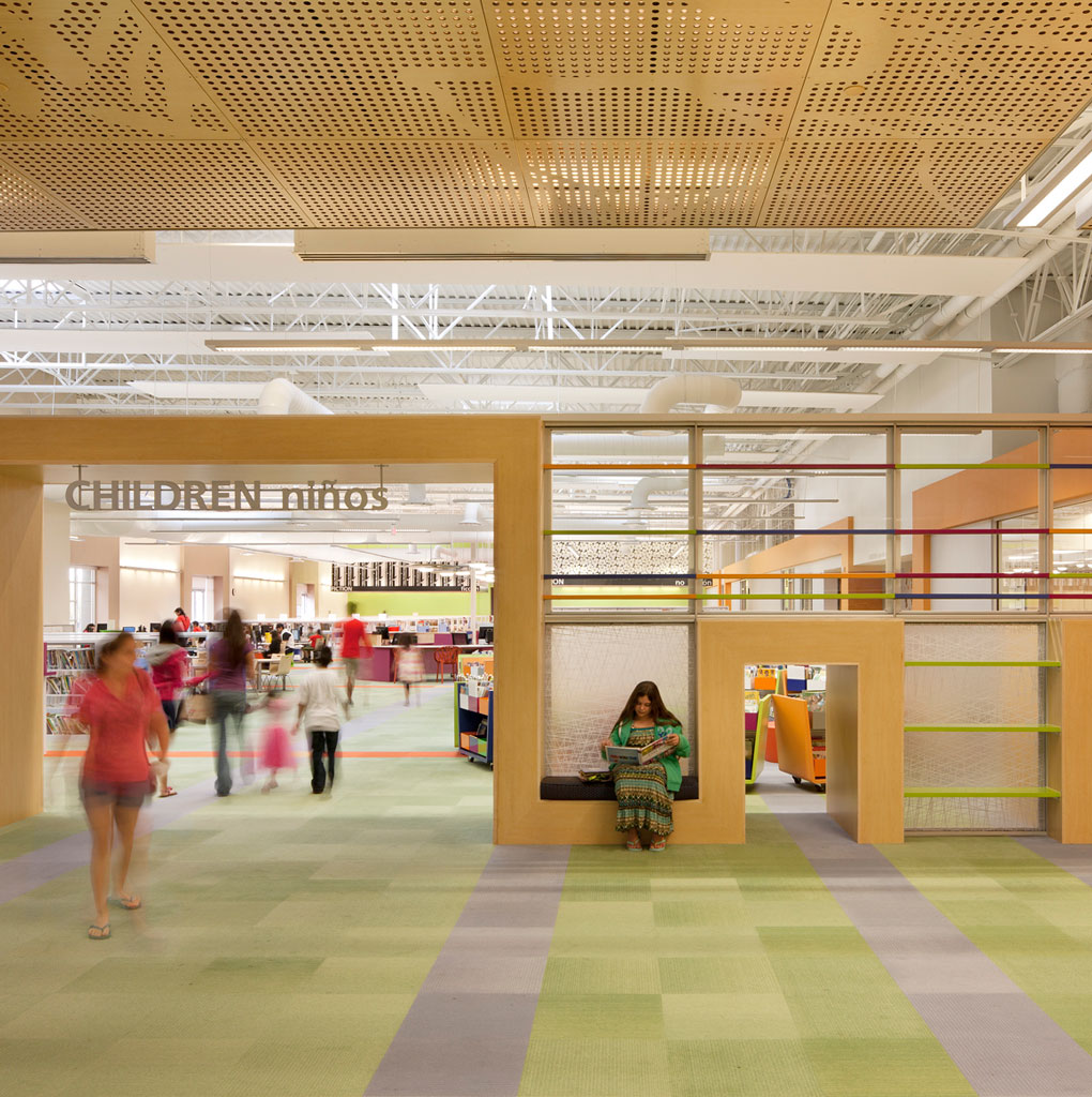
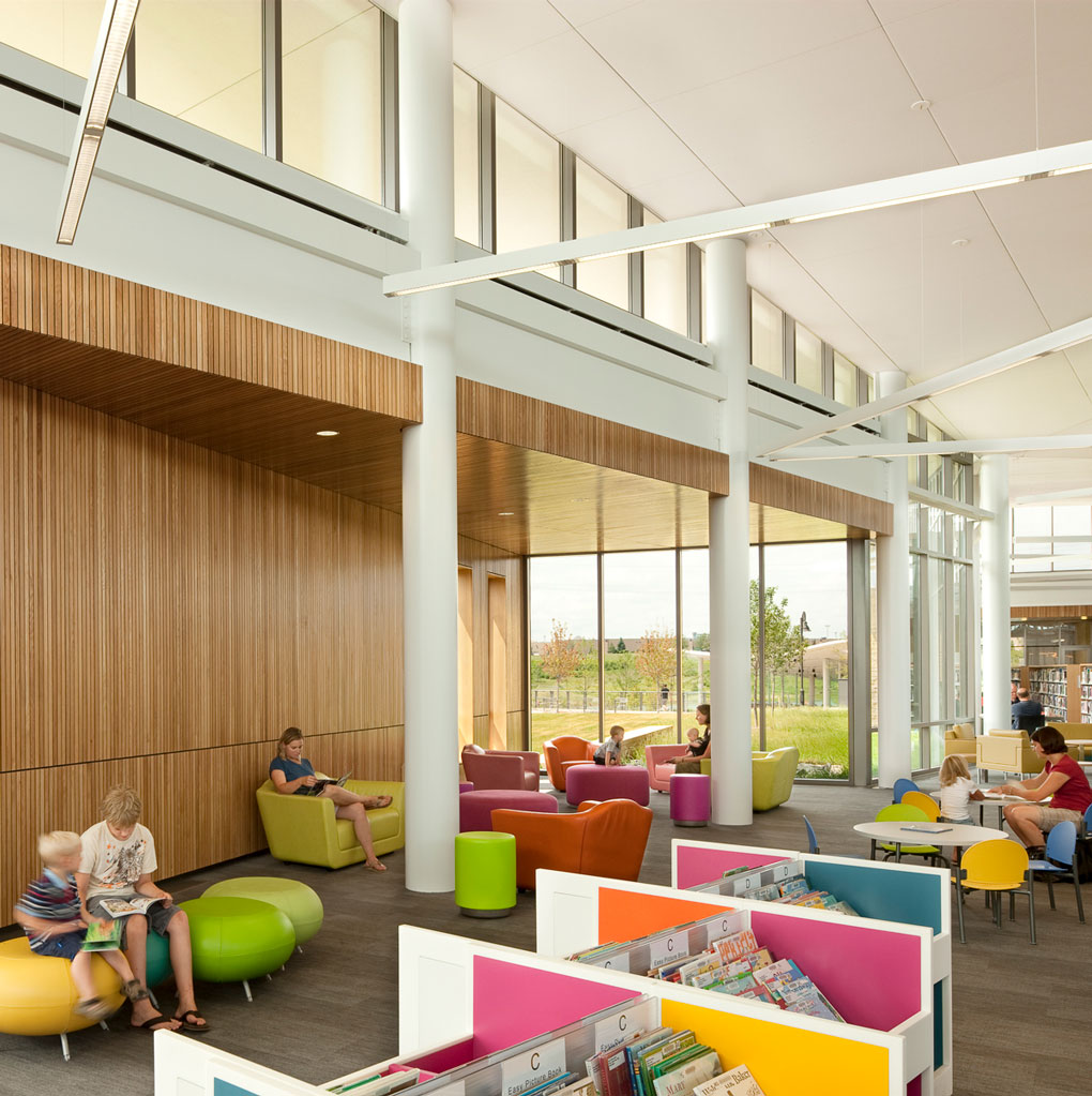
Identity: Use visual hierarchy to direct attention to areas, such as through lighting, ceiling, or material cues. For example, the new McAllen Public Library, located in a converted Wal-Mart, uses super pendants to mark reading areas and create visual interest and hierarchy of space.
Alignment of use: As libraries become overcrowded, new spaces often pop up in places that don’t support them well. Reassess what would best support each activity in your library and make changes to accommodate them. Does it really make sense to keep that quiet-study table now that you’ve added a new teen area directly adjacent to it?
And, finally, avoid adding layer upon layer of signs to direct your customers and focus instead on getting the above root aspects right. Adding more signs to help people understand your building is the equivalent of putting on earphones to drown out your car’s engine knock, instead of fixing the problem causing the noise.
Step 2: Remove barriers
Intuitive wayfinding and the ability to visually read a building are important aspects of a well-designed library interior. As with a book or article, a library interior succeeds best with consideration of the whole and great editing. Find ways to remove visual and physical impediments to using your library and easily accessing the resources within. For example, if tall shelves block sightlines from the entry, consolidate materials in order to remove shelving or reduce its height. If no amount of weeding will allow you to eliminate or lower shelving, consider changing the orientation of your stacks. Do the shelves create aisles inviting exploration, or do they create walls that prevent sightlines through your building? Are views to the exterior available, enabling customers to orient themselves?
Fixtures and furniture can be a barrier. Monumental service desk: R.I.P. Large, inflexible, and immovable custom-built desks present a visual and literal barrier to your customers. Often these desks have been located front and center, and customers’ eyes stop there. It’s time to get out of your comfort zone and down-size those desks, or replace them completely. Push the desks a bit to the side to open up views through the library. Most leading library systems are using service desks made up of reconfigurable and flexible furnishings with a much smaller footprint.
Sometimes libraries have added and removed rooms over the years, in a piece-meal fashion and without comprehensive consideration of the interior. This process can lead to rooms that block access to areas of the library, or to rooms located in areas that do not make visual or functional sense. Think about how to reconfigure your interior to enhance the overall usability of your library by first considering the whole. What is your goal for users of your building? What should each area of the library represent, or help you accomplish? Once you can answer these questions, steps to take in editing your library will become clear.
Step 3: Use less for more impact
When it comes to design, the adage “less is more” is often true. When it comes to library interiors, the mantra should be “simplify.” Humans naturally seek patterns to help us make sense of the world around us. Therefore, visual chaos or disjointedness, whether consciously noticed or not, can affect our perception of a building. How easy is it to find what we need? How comfortable is it to be in? How helpful is the staff? Do we want to visit the library again?
Keep the idea of simplifying in mind when considering application of interior color or pattern, the use of wayfinding or informational signage, or adding fixtures and furniture. In the “Remove the Barriers” section, I wrote about considering the whole of your library interior when making a decision about updating your space. This approach will help you prioritize and maximize impact. Eclectic only works if you have a unifying thread. Use color, line, scale, or material to unify the design.
Many libraries collect materials display fixtures the way children collect rocks: without regard to what they already have and with total belief that the latest is the greatest. Before purchasing the latest/greatest display from your favorite library furniture catalog to add to your collection of the latest/greatest displays of the past several years, consider first:
- What do you aim to accomplish, and is an additional fixture the best way to achieve it?
- Does it relate in material, line, or color to your existing displays? f not, can you donate the existing displays and update all of them at the same time?
- Does the display provide a clear hierarchy of where to direct your customers’ attention? Or are you ultimately creating visual chaos rather than visual clarity?
If everything is special, nothing is special.
Step 4: Unclutter
I’m always amazed at a library staff’s ability to collect. I’m sure the practice would be great psychological fodder, considering the tenets of the library profession. Consistent favorites are signs, displays, signs directing customers to the displays, pamphlets, and notices on the service desk. Clutter abounds in many libraries.
As I mentioned in the blog post “Use Less for More Impact,” visually chaotic surroundings intimidate many library users. Where should customers focus their attention? Resist the urge to add signs about every service or rule for using the building, and instead ask yourself why it isn’t intuitively apparent what to do in the first place. Then address the core issue. Chances are the customers are going to ask a live person (or give up and leave) rather than visually sift through a series of notes and directions anyway. Using a retail analogy, each interaction is an opportunity to add value to the customers’ experience and keep them returning—and therefore learning!
Many libraries collect but forget to purge. Just as good collection management practice includes both acquisition and weeding, so too does good interior environment management require editing. Since libraries are often underfunded, a starvation mentality often pervades, making it difficult to let go of items or to turn down a perceived windfall. Continually ask yourself, William Morris style, “Is this useful? Does it contribute to the overall success of using my library? Is it so beautiful that it adds to the delight of using the library?” If the answer to any of those questions is no, out it goes.
Step 5: Clarify
Successful library interiors have a thread that binds the interior components together. Not to be confused with matching, this concept means that all aspects, from the interior architecture to the furniture, work in harmony and relate to one another. Harmony can be achieved in many ways. One method is to use repetition of material, visual line, or a color family. Another way is through gradation of size, color, or even activity.
In a previous blog post, I wrote about the famine effect many libraries suffer: an inability to let go of accreted items or to refuse so-called windfalls of furniture. Resist the urge to hoard. Consider each new acquisition of furniture and each new application of color in the context of the whole interior. Find ways to unify furnishings and fixtures through material, color, and form. Pay attention to the details of your interior architecture—the wood species and color, the ceiling material, the window trim detail. Consolidate similar items, such as locating the free materials and community notices with other self-service items, including change machines, self-checks, or copiers.
Librarians sometimes decide to freshen or warm up the library interior by using paint colors (makes sense given that paint is inexpensive and easy to apply). In many cases, however, the desired effect is not achieved. Too many un-related colors are used (primary colors do not make a cohesive interior), multiple colors are applied with the same intensity, or inconsistent rules are used to determine where color should be applied. Err on the side of fewer colors, not more. Recognize that just as a library collection has sub-collections, paint can be applied using a hierarchy. Be consistent in your application of color and mindful of what your objective is in using a particular color. For example, if you want to add color to call attention to all of the public lounge areas, perhaps adding color to the janitor’s closet should be avoided. If you add color to enliven the teens’ area, color on the columns in adjacent areas may detract from that focal point.
Clarity illustrates intent, and a library’s intent is to promote learning. Learning is enhanced when the environment where it takes place allows the brain to focus on the task at hand.
Step 6: Capitalize on assets
Take a step back—way back—and consider your library interior objectively. Imagine your building completely void of all furniture, equipment, and shelving. Make a list of the assets and the liabilities. One way to start this process is to consider where your customers naturally gravitate to and which areas of your library are the last to be filled on a busy day. Do you have windows that offer a beautiful view? Do you have a space with special character? Does your library contain natural building materials such as stone, wood, or brick on the interior that customers frequently compliment?
Now consider how humans use space. We seek natural light and views, and we want to be sheltered. We appreciate choice in our surroundings to suit our mood or task. Does your building’s interior architecture offer opportunities for choice, such as areas that would make nice reading nooks? Does your seating take advantage of the natural light or views to the exterior?
Perhaps you have wonderful windows, but shelving blocks them. Could the shelves be rotated, moved, lowered, or eliminated to let more daylight into the interior? Perhaps you have a quirky room that would make a great study lounge, but it’s being used as a staff office. Could careful planning in another area that houses staff make room for more customer space on the public floor and allow you to turn that area into a hotspot?
With the current emphasis on open, flexible floor plates, many libraries with older buildings (such as a Carnegie library with several small rooms) may feel they are at a disadvantage when seeking to create a modern library experience. Use these rooms to your advantage by zoning your library’s activities to fit each room, or embrace the fact that the rooms can offer intimate study, reading, and social areas that will appeal to your customers.
Often, capitalizing on your building’s assets merely requires a fresh eye, attention to your customers’ use patterns, and some elbow grease.
Step 7: Zone your interior
Adaptability is a key element in a well-designed library building. Libraries are being asked to accommodate myriad functions today. Because none of us has a crystal ball, a library building’s adaptability and flexibility play a crucial role in the determining how well the library will function in the future.
Designers often provide flexibility by designing and renovating libraries to have a wide-open floor plate with very few walls. Although this strategy allows the building to be easily reconfigured, it can also be a source of headaches for the library customers and staff, if the building isn’t zoned by activities, use, and acoustics.
Consider the sources of sound within each area to avoid conflicts in acoustics. Sound comes from many places. The most obvious source is air-borne noise such as speech or music, but sound also comes from structural vibration (e.g., the moving parts of mechanical equipment sending vibrations through the floor) and impact (e.g., footfalls on a hard floor). Understanding how and where sound is generated is an important first step in zoning your interior. Some noise issues may be too costly to address, such as isolating or eliminating mechanical noise. Zoning activities can help to greatly reduce the effect of the noise.
Think through the host of likely activities within your library to avoid conflicts in privacy, security, sociability, and acoustics. Some people come to your library to socialize, while others come for quiet study. To meet the needs of a diverse mix of customers, your building should gracefully accommodate both and everything in between. Consider the activities that are noisy—for example a coffee shop that is commonly used as a place for meeting and conversation. Consider the activities that are likely to be quiet, such as researching family genealogy. Which function is best located adjacent to the new materials display?
Most people are tolerant of noise when they have an expectation that it will be present. Zoning your interior based on the level of activity and sound will help make it clear which areas are meant to be quiet and which areas are meant to be livelier.
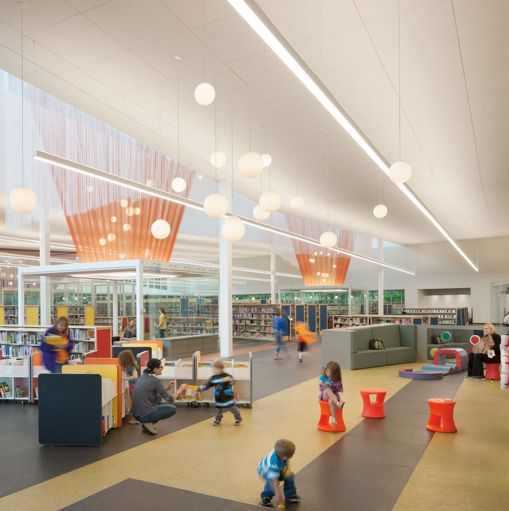
Step 8: Create variety
One size does not fit all. Websites such as pinterest.com and dwell.com and television shows such as HGTV’s “Secrets from a Stylist” have broadened the general public’s tastes and opened many minds regarding design and possibility. These venues for design exploration and exposure combined with the ability to customize everything we consume (from the fine-tuning of our coffee to the color of our laptops, from the comfort of our mattresses to the timing of our news consumption) have influenced your customer’s perception of your library building. Today’s library customers appreciate design, are more conscious of their surroundings, and expect choice in their experiences, including in your library building.
Humans are hard-wired to value visual and spatial variety in our surroundings. Consider a forest, as an example. It offers an abundance of visual textures (e.g., moss, berries, leaves, roots, bark, tree canopy, filtered sunlight, and animals) and types of spaces (e.g., a ground hollow, nest, cave, and perch in a tree). This diversity provided security and sources of nourishment for our ancestors. We find innate comfort in a visual and spatial variety that reflects nature. This phenomenon does not mean we must duplicate the colors and textures found in nature. It means that just as a forest has ground cover, mid-ground plants, and a tree canopy, so too should your library interior. Consider the last seminar you attended in a hotel conference space. It was likely a nondescript box void of natural light, with putty-colored walls and floor and a flat ceiling with ubiquitous fluorescent lights. Have you noticed how disquieted you feel in a room like that? That discomfort can be attributed to many things, from uncomfortable seating to the amount of fresh air available, to the lack of daylight. It can also be a result of our innate need for visual and spatial variety.
Variety and choice should also be offered in experience. Libraries invite collaboration to varying degrees. While a sea of study tables could technically allow different types of collaboration to take place, it doesn’t support them. Worse, it ignores our need for spatial variety and choice. Successful library interiors offer spaces and furniture that support a broad range of gathering options through different types of experiences. This approach can be accomplished in simple ways, such as providing a mix of seating environments (a booth that supports collaboration versus a solitary high-backed lounge chair near a window for privacy). Or it can come from more complex means, such as customizable lighting or movable walls that allow customers (and staff) to create places that work for the level of interaction they desire. Your customers will thank you for whatever amount of choice and variety you can offer.
Step 9: Lighting shapes a space
We tend not to notice well-designed interior lighting in a library. Unfortunately, poorly-designed lighting is seen and can ruin an interior (or worse, our productivity and well-being). Lighting a building is a science and an art. It takes science to understand how light works and to provide the right amount of light for the task at hand. It takes art to light in such a way that the space is not only functional, but also beautiful. A room’s lighting may technically meet the basic requirements for safety, yet create an environment that is uncomfortably bright, or that renders colors poorly, creating a disquieting space.
Multiple considerations go into good lighting design, including determining the color temperature (whether the light appearance is warm or cold), energy consumption, intensity of light appropriate for the function, eliminating glare, quality of light, source of light, use of daylight, and more. Two factors cause particular problems for library buildings.
The first factor is the mix of lighting used.. Many libraries use only ambient lighting, resulting in a flat interior. Just as variety in color and texture create a more interesting garden, combining different light sources and fixtures helps provide a more pleasing interior space. The most successful library interiors use a smart, tiered approach to lighting—mixing ambient (overall) electric light with daylight, task light, and accent light—rather than simply flooding a room with a one-size-fits-all approach.
The second factor is the amount of light used. Many library buildings are over-lit, wasting energy and operating dollars, tiring our eyes, and creating uncomfortable spaces. Varying light levels throughout an interior allows our eyes to rest, saves energy, directs attention to particular areas, and cues behavior. For example, spotlighting a display fixture draws attention to the materials. Using lower ambient light levels in a quiet reading area and supplementing with task lighting cues library users to respect the intent of a quiet area. Just as dimming the lights in a theater acts as a signal to quiet the audience, less light in a reading area acts as a cue to interact in the space quietly.
For an overview of lighting basics, please see: http://www.ies.org/lighting/
Step 10: Embrace color
Color permeates our culture on so many levels and in so many ways—in fashion, product design, interior design, and even the food we like. Fields of study are dedicated to the psychology of color and its affects on physiology, our ability to concentrate, and our memory. Color profoundly influences our attitudes and behavior. Designers in all fields forecast color trends. These trends influence everything from the products we buy to the clothes we wear and are linked to such things as the economy and overall mood of a nation.
Librarians often have a love/hate relationship with color in their building interiors. They recognize its importance but struggle to apply it in a pleasing way. Strategic use of color can direct attention toward an asset and away from a liability. Color can help give boundaries to a space. Color can signal how to behave. It can add warmth, liveliness, or gravity. And especially when applied through paint, color is easy and inexpensive to change, so you can refresh your library interior over time.
Successful use of color requires being mindful of context and contrast. Keep in mind the inherent assets in your building, your customer base, and your goals. For example, your library interior’s best asset may be windows that reveal a lovely view. The goal would be to enhance enjoyment of that view rather than detract from it. A common misstep with windows is creating high contrast through the application of color. A dark color might be applied to the adjacent walls to call attention to the view, when in actuality the contrast between a bright window and dark adjacent surface detracts from the view. Our eyes must constantly adjust between the dark wall and the bright window, which tires them and diminishes appreciation of the view. Another common misstep is to use too many disparate colors in a space without regard for context (e.g., scale of space or competing visual aspects), resulting in a disjointed appearance. As good writing gains clarity through editing, so too does use of color.